


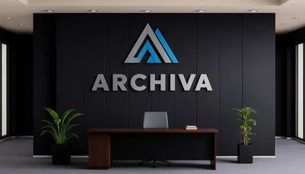
Accessible reception signage should be a breeze to spot, read and make sense of as soon as you approach it. Good contrast, minimal glare, right font size, & mounting at a perfect height for where people are all these things make a big difference for people with low vision, wheelchair users, older visitors & anyone who isn’t familiar with your office.
And even if your reception wall looks polished, your logo can still blend right in, if your letters are too high up, or the lighting creates a nasty glare.
In the UAE, accessibility should be right at the top of your mind when designing reception signage. Dubai’s Universal Design Code says strong contrast is a must, glare is a no go, and text size needs to be right for the distance people are viewing it from. Trakhees Accreditation
Colour Contrast Isn’t Just About Being Seen It’s About Being Read
Brands often go for a muted palette but that doesn’t mean the text will stay legible on every wall. Dubai’s Universal Design Code wants to see a clear contrast of at least 50 LRV between the text & the background. And to avoid nasty reflections. Trakhees Accreditation
With 3D signage, it’s not just about the colour’s depth that adds another element to consider. Raised letters create shadows & if you add some halo lighting, it changes how the edges look entirely. What looked good in a model might look entirely different in real life, especially under warm downlights or daylight on a polished marble floor. Trakhees Accreditation
| Design factor | Weak approach | Better approach | Accessibility effect |
| Contrast | Similar foreground/background tones | Clear light-dark separation | Easier letter recognition |
| Surface | Highly reflective finish | Matte or controlled sheen | Less glare |
| Lighting | Bright spots on lettering | Even illumination | Clearer edges |
| Letter size | Chosen only to fit the logo | Sized for viewing distance | Better distance reading |
| Position | Based on empty wall space | Planned around sightlines | Easier to locate |
Mounting Should Match How Reception Is Used
You’ve got big logos behind a desk, room identifiers & tactile signs all doing very different things so you can’t use the same height for all of them.
Dubai guidance says signs should be placed consistently, not in the way of the accessible route, and without any glare or obstructions. Some wall signs need a centred height of 1600 mm with the top edge at 1750 mm; tactile wall signs have their own rules around 1500 mm. Trakhees Accreditation
This is important. Branding that can be seen from across the lobby is going to sit differently from information that someone needs to read closely or touch.
Viewing Distance Dictates Letter Size
The further away a visitor is from the sign, the bigger the text needs to be. Dubai guidance links font size directly to reading distance 28 mm at 2 metres, 42 mm at 3 metres, and bigger for even easier reading. Trakhees Accreditation
Reception signage should be measured with the real room in mind. Look where visitors enter, queue up, sit, & where they first look towards the desk not just based on what looks good in a design.
Design 3D Signage That Meets Real People’s Needs
People show up from all sorts of angles from a corridor, in from the side, hanging out at a lower level, or looking at the wall past the furniture.
You should definitely do a site survey to figure out:
- the main route people take and how far they need to read the sign;
- what people can see seated, standing and in a wheelchair;
- the wall colour and how shiny it is;
- what glare from daylight and artificial light does and doesn’t do;
- whether the sign for directions is fighting with the business logo.
Dubai also says that signs should be at places where people need to make a decision and are best seen by wheelchair users and little kids while avoiding places that get glare or are in the shade. Trakhees Accreditation
Sensible Planning Can Save You a Lot of Headache Down the Line
Accessible design often means making the system that already exists work better, not adding more signs.
If you get the sizing, contrast and mounting right before you start building, you can save yourself a lot of extra work and expense and the same goes for using good materials, breakapart components and efficient lighting. This can all help the sign last a lot longer.
For UAE businesses looking to get some reception signage sorted, Colour Print can help with custom fabrication using things like acrylic and aluminium, as well as office, indoor logo and illuminated signs. And because we do all sorts of printing work, you can keep your branding looking consistent across all your signage.
Practical Checks Before Signing Off On The Artwork
Have a look at the artwork from down at the actual entrance and in the areas where people sit. Check the wall under normal lighting and see if shadows are going to make things unclear and whether the reception desk is blocking important information.
If you are looking for the best 3D signage company in UAE then you’re probably already thinking about whether the supplier is going to consider the wall surface, how far away people will be, what the lighting is like, the fabrication process and installation before they start making your sign. Colour Print’s range covers all sorts of applications: office, acrylic, aluminium, illuminated and reception so we can help you make all these decisions at the same time. Colour Print
Frequently Asked Questions
What colour contrast works best for reception signs?
A clear lightdark difference works pretty well for legibility. Dubai’s accessibility guidelines say there should be at least a 50 point difference in reflectance contrast between the text and its background for applicable signage. Trakhees Accreditation
How high should reception signage be mounted?
It depends on its job. If people need to see the sign from a distance for the branding, and you need to read it up close then the positioning is going to be different.
Does 3D signage help readability?
It can. Extra depth can make things clearer but if the lighting is poor and the colour contrast is weak then that advantage goes out the window.
How do I choose the right letter size?
First off, measure out how far people are most likely to be from the sign. The bigger the letters the further away you can stand.
Can I still get some proper quality out of my accessible office signs?
Absolutely yes. If you get the information clear, some sensible contrast, right placement, decent lighting and don’t make it too hard to use then you can still have some very nice signs. Acrylic, metal, dimensional letters and nice shiny finishes can all add to a nice interior look.
Conclusion
A good reception sign should help people spot who you are and what’s going on pretty quickly and easily. When you take into account colour contrast, distance and lighting right from the start, accessibility becomes part of the sign’s design rather than something you do as an afterthought. Is your reception sign positioned and contrasted for the people who really need to see it?